Below are the three selected sketches.
Besides, I have added on typography.
First sketch:
Title : Storm Hits!
Tagline:
Do Not Use Your Phone During A Thunderstorm!
Full Article:
Next time you find yourself talking on your mobile phone in the middle of a thunderstorm you may want to cut the conversation short.
Visual Concept Description:
By applying the surrealism, the concept of using the aquarium is to bring out the unexpected element match with the thunderstorm. The aquarium is used to symbolize the raining or the water is the conduction of the lightning strikes (electric). The human drown in the aquarium is to create the sense of fear which using phone during a thunderstorm may lead fatal.
Colour Theory Analysis:
The tagline in RED is to draw attention and also indicates danger. Cool color is also being used as BLUE is the color of water.
Typography Theory Analysis:
I have chosen Postinkantaja Job Font as it can match with my design concept. The design is slightly towards cartoon based, which is not so formal. And this font type is a bit fancy and it is a decorative typeface to decrease the level of formality. Besides, I have added kerning, which is the spaces between the words by words in order to make it more readable.
Elements of Design Analysis:
Line:
Uneven line is to form the dark clouds and bring out the unsettling feel. Cursive lines are to draw the hairs.
Shape:
Circles to form bubbles. Lightning formed by Z-shaped. Organic shape is the naturalistic shape such as clouds.
Value:
The bottom area of the design is darker than the upper part to draw the focal area. The upper area can be easily attracts the first attention.
Color:
Cool color such as blue used for the water and bubbles. Red color for font is to symbolize the danger or hazard messages.
Texture:
There is no tactile texture. Only visual will do, which is the result from light being absorbed by the surface of dark area. The aquarium will be in glossy visual texture.
Alignment and Proportion:
The lightning, human and the aquarium have a visual connection with each other which they align with each other. The clouds and the aquarium are not close but they belong to same place.
Eye Movement:
Light area to darker area draws the flow of eye movement.
Principle of Design Analysis
Hierarchy:
The human at the center is the focal point of the design. It dominance the design and attracts the viewer’s first attention.
Balance:
A-symmetrical balance is in this design where the objects achieve equal visual weight. Two-third of the area is high in value (lighter) and one-third of the area is low in value (darker).
Proximity:
The clouds and lightning are close to each other and close to the aquarium to seen as a cohesive group.
Rhythm/Repetition:
Repetition of the clouds and small bubbles are to make it lively.
Scale:
Intimate scale is applied on the human who can fit in the aquarium because it is smaller than what is seen as “normal”. Shock scale is applied on the aquarium because it is oversized that they base no relationship to human size.
Unity/Variety:
The combinations of the elements such as line, shape and color in the design are bringing the unity and wholeness feel.
Second Sketch:
Title: Release the health time bomb!
Tagline:
Don’t let the phone harm your body.
Full Article:
"Mobile phones could be a time bomb of health problems -- not just brain tumors, but also fertility, which would be a serious public health issue."
Visual Concept Description:
The concept comes from the thought of radioactive of cellphone may harm human health. Hence, I decided to use a human figure to bring out the message. In order to create the unexpected / surprise idea, by unzip the human skin to see the message and to remind public that human body is also a no phone zone.
Color Theory Analysis:
Warm color is mainly used in this poster in order to bring out the harmony and the softness of the lady. Yellow is to represent the good health, optimist feel.
Typography Theory Analysis:
This “The Dreamer” font type is slightly cursive and it is match with concept of design. Cursive font is to match with the softness and the feminine of the lady.
Elements of Design Analysis:
Line:
The combination of uneven lines is to form the bunch of hair. Slightly curl line is to form the eye lashes.
Shape:
Rectangular shape is which on the phone’s screen. The repetition of small rectangular to
Value:
The lighter area tend to bring out the darker area to be more concentrate and outstanding.
Colour:
Bright color such as yellow, green and red tend to grab the attention. The background color is lighter than the lady is to make the lady more outstanding.
Texture:
Visual texture is to show the smooth of the human skin.
Alignment and Proportion:
The size of the human body and the hand demonstrates the size relationship. The proportion of the human body is almost covering the whole design.
Eye Movement:
The illusion movement was drawn by the lines of zip.
Principle of Design Analysis
Hierarchy:
The unzip part of human skin dominance the design. It grabs the attention and curiosity of viewer’s eyes.
Balance:
A-symmetrical balance is where the objects achieve eye visual weight and it is not totally equal.
Proximity:
The hand and the zip on the lady’s body are physically close to each other, so that related are seen as one cohesive group.
Rhythm/Repetition:
Rhythm brings by the zip where its zip formed by repetition of lines.
Scale:
Normal scale is used in this design where the human body and hand are true to the ‘normal” human size.
Unity/Variety:
The balance of elements such as like, color, and texture result a completeness where all the components visually belong to one another.
Third Sketch:
Title: Life, Phone, Intravenous Drip.
Tagline:
Turn Off Your Cell Phone.
Full Article:
Radiation interferes with sensitive electronic medical devices to keep patients alive. The electrical system in our brain is every bit as sensitive as medical electronic devices.
Visual Concept Description:
The concept comes from the idea of hospital. Hospital is a no phone zone. There are cases happened in the hospital that the frequency of cell phone affected and interrupted the medical devices and caused the faulty on medical treatment process. Hence, I would like to use the intravenous drip and heartbeat analysis machine to represent hospital, and the human who drown in the water is to symbolize the cause of death.
Color Theory Analysis:
Light blue color as background color is used to represent the cleanliness and honesty feeling of the hospital. Red color line and words are to stir the emotion of danger, to create awareness and warning.
Typography Theory Analysis:
The “BSBDF 50” font is which has a little washed out feeling and I think it is match with my theme because it can create the feeling of unsettling. The font type in red can bring out the unsettling feel as to bring out the message of phone may interrupt medical devices and cause fatal.
Elements of Design Analysis:
Line:
Fine horizontal and vertical lines are on the screen of heartbeat analysis machine. A thicker uneven line in red is to show the heartbeat analysis.
Shape:
Geometric shape – rectangle for the heartbeat analysis machine. Circle shape – button and the water bubbles. Waterdrop shape.
Color:
Cold color such as blue is used to bring out the clean, calm and harmony feel. And the red is to emphasize the tagline and create awareness and warning to viewers.
Texture:
Only visual texture will be bring out in this design. The screen of the heartbeat analysis machine and the container of the intravenous drip will be in the texture of glossy.
Alignment and Proportion:
The intravenous drip and the heartbeat analysis have a visual connection which they align with each other and seem in close distance. Both of these components stand the proportion of two-third in the design.
Eye Movement:
First sight will drop at the human who in the intravenous drip, then followed by the dripping of water drop, next to the red tagline and the last flow to the heartbeat analysis machine.
Principle of Design Analysis
Hierarchy:
The human in the intravenous drip is the center of interest which first attracts attention.
Balance:
A-symmetrical balance is in this design which it only has a visual equal balance.
Proximity:
The distance between the intravenous drip and the heartbeat analysis machine is in order to leave a space for the tagline, and hence to be seen as a cohesive group.
Rhythm/Repetition:
The repetition of the dripping waterdrop is to bring out the rhythm and makes the eye movement flow seems to be more natural and lively in the design. The graph line in the heartbeat analysis is also bringing out the rhythm.
Scale:
Intimate scale is applied on the human who can fit in the intravenous drip because the human seen to be smaller than what is seen as “normal”. Normal scale is applied on the heartbeat machine.
Unity/Variety:
The components and elements in the design is bringing the feel of unity and completeness as the space between the intravenous drip and heartbeat analysis machine is placed appropriately to balance the optical weight for the whole design.
Tuesday, 18 October 2011
Monday, 17 October 2011
Sketches.
The title i have chosen is NO PHONE ZONE.
Below are my sketches:
Be Silence, Library is a NO PHONE ZONE.
Do not use the phone while Thunderstorm.
(Surrealism)
Life is no turning back, Put your phone away while driving.
(Surrealism)
Don't let the phone harm your Health.
(Surrealism)
No Texting while driving.
(Surrealism)
Life is no turning back, Apppreciate your life.
(Surrealism)
Driving is a No Phone Zone.
No Phone Zone.
Radioactive harm us. No Phone Zone.
Typography art.
Typography art.
Respect Others.
Put awhile Phones while driving.
Do Turn Off your cell phones.(Hospital)
Choice is on your hand.
Tuesday, 20 September 2011
History of Surrealism.
Sur - re - al - ism (n.) -(often l.c.) a style of art and literature developed principally in the 20th century, stressing the subconscious or nonrational significance of imagery arrived at by automatism or the exploitation of chance effects, unexpected juxtapositions, etc.
Retrieved from:
http://www.surrealist.com/
------------------------------------------------------------------
In the Beginning
Surrealism as we know it today is closely related to some forms of abstract art. In fact, they shared similar origins, but they diverged on their interpretation of what those origins meant to the aesthetic of art.
At the end of the First War World, Tristan Tzara, leader of the Dada movement, wanted to attack society through scandal. He believed that a society that creates the monstrosity of war does not deserve art, so he decided to give it anti-art–not beauty but ugliness. With phrases like Dada destroys everything! Tzara wanted to offend the new industrial commercial world–the bourgeoisie. However, his intended victims were not insulted at all. Instead they thought that this rebellious new expression opposed, not them but the "old art" and the "old patrons" of feudalism and church dominion. In fact, the bourgeoisie embraced this "rebellious" new art so thoroughly that anti-art became Art, the anti-academy the Academy, the anti-conventionalism the Convention, and the rebellion through chaotic images, the status quo.
One group of artists, however, did not embrace this new art that threw away all which centuries of artists had learned and passed on about the craft of art. The Surrealist movement gained momentum after the Dada movement. It was lead by Andre Breton, a French doctor who had fought in the trenches during the First World War. The artists in the movement researched and studied the works of Sigmund Freud and Carl Jung (but not at online universities). Some of the artists in the group expressed themselves in the abstract tradition, while others, expressed themselves in the symbolic tradition.
Two Distinct Groups Emerge
Michael S. Bell, through his research, realized that these two forms of expression formed two distinct trends of surrealism with marked differences. One could be qualified as Automatism, the other, as Veristic Surrealism. "Automatism" explains Mr. Bell, "is a form of abstraction. It has been the only type of surrealism accepted by critical reviewers after the war."
Basically, two different interpretations of the works of Freud and Jung divided the two groups. For the purpose of personal analysis, Jung had talked about not judging the images of the subconscious, but simply accepting them as they came into consciousness so they could be analyzed. This was termed Automatism.
The Automatists
When psychology talked about Automatism, these artists interpreted it as referring to a suppression of consciousness in favor of the subconscious. This group, being more focused on feeling and less analytical, understood Automatism to be the automatic way in which the images of the subconscious reach the conscience. They believed these images should not be burdened with "meaning."
Faithful to this interpretation, the Automatists saw the academic discipline of art as intolerant of the free expression of feeling, and felt form, which had dominated the history of art, was a culprit in that intolerance. They believed abstractionism was the only way to bring to life the images of the subconscious. Coming from the Dada tradition, these artists also linked scandal, insult and irreverence toward the elite's with freedom. They continued to believe that lack of form was a way to rebel against them.
The Veristic Surrealists
This group, on the other hand, interpreted Automatism to mean allowing the images of the subconscious to surface undisturbed so that their meaning could then be deciphered through analysis. They wanted to faithfully represent these images as a link between the abstract spiritual realities, and the real forms of the material world. To them, the object stood as a metaphor for an inner reality. Through metaphor the concrete world could be understood, not by looking at the objects, but by looking into them.
Veristic Surrealists, saw academic discipline and form as the means to represent the images of the subconscious with veracity; as a way to freeze images that, if unrecorded, would easily dissolve once again into the unknown. They hoped to find a way to follow the images of the subconscious until the conscience could understand their meaning. The language of the subconscious is the image, and the consciousness had to learn to decode that language so it could translate it into its own language of words.
Later, Veristic Surrealism branched out into three other groups.
Retrieved from: http://www.gosurreal.com/history.htm
------------------------------------------------------------------
Three main families were recognized by Mr. Bell as emerging from Veristic Surrealism:
1) Classical Surrealism takes the dream images of the unconscious, letting them flow on the canvas without interpretation or judgment, thereby permitting everything to coexist as in a dream.
2) Social Surrealism works with symbolic images representing the inner visions of the workings of man within the context of the collective unconscious. Social Surrealism uncovers the monsters created, and the suffering inflicted, by man's misinterpretation of reality. It exposes, examines and satirizes the hypocrisy of society, making it the most unsettling type of Surrealism. Because Social Surrealism looks for the true meaning of justice, it conveys the reality of how all societies fall short of their highest potential.
3) Visionary Surrealism expresses all that is positive in the human experience, and the intuitive awareness of a Supraconsciousness as the directive Mind behind subconsciousness and consciousness. Visionary Surrealism perceives the Cosmos or total order of the universe, and the divinity of mankind. It explores the true symbols in mythology, philosophy, and religion, uniting them with the symphony of the goodness of the universe. It sees the inner wisdom of man behind his ignorance and fear. Its purpose is to reach man's true SELF, through the realization of Cosmic Consciousness.
Retrieved from: http://www.gosurreal.com/research.htm
------------------------------------------------------------------
Sunday, 18 September 2011
Part 1_Research and Reference.
I have chosen the artworks from Lohmuller Gyuri, a Romanian artist.
His paintings's art movement are mainly on Surrealism Art.
Surrealism is developed principally in the 20th century.
It stresses the subconscious or non-rational significance of imagery.
It features the elements of surprise or unexpected juxtaposition.
I love his artworks because of his creativity and the color tone used,
which make the artworks seem to be more outstanding.
Besides, the unexpected elements match in the artworks surprised me.
I found some indescribable feelings while i looking at his artworks.
Lohmuller Gyuri
He is a self-taught painter,
which has little recognition received in the form of awards and exhibitions.
But still, he never give up.
His motto,
“If I ever make a good painting, I will be excused for being a painter.”
He is willing to share his inner world, which reflect his deepest emotions through the artworks.
"The emotion", he says, "is Art."
"Bridge over the Winter"
LohMuller Gyuri
Oil in Canvas - 31 inches x 24 inches
Surrealism art:
Stressing the subconscious or non-rational significance of imagery.
It features the elements of surprise or unexpected juxtaposition.
Principle:
Hierarchy: the middle largest piece - dominance in the design.
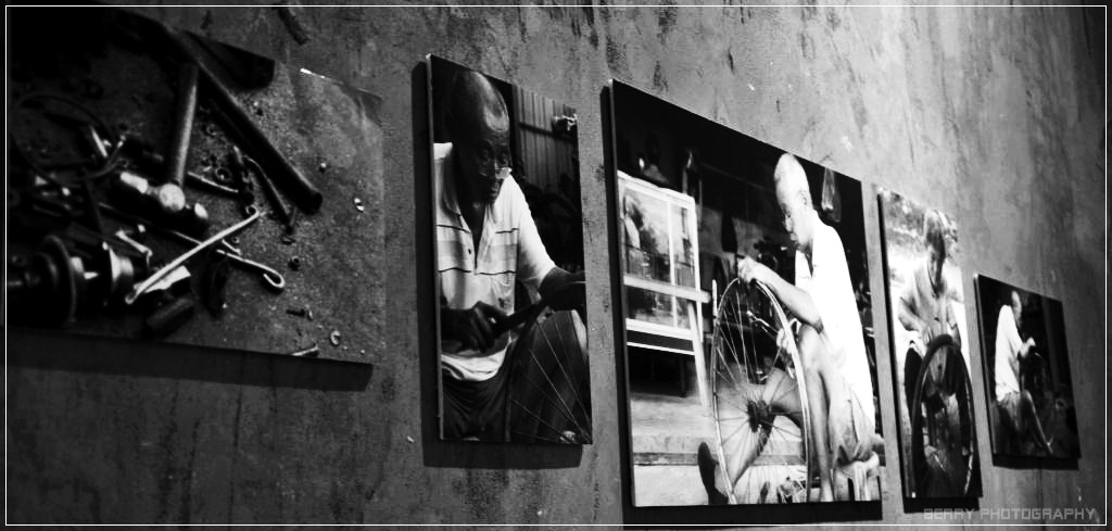
Balance: asymmetrical - left portion heavier than right portion.
Proximity: placement of each piece of the pictures
Unity: the pieces of pictures are related to each other - harmonious blend of all elements (color, space, shape, line).
Rythme: the arrangement of the bricks ( top - well arranged, bottom - the bricks dropping), the arrangement of trees. All these create a visual rhythm.
Elements:
Shape: Irregular shape - pieces (shadows bring out the 3D form), bricks. Rectangular - Door.
Color: Dark orange as background to bring the contrast with the pieces. Soft color tone for the pieces is to bring out the romance feel. Bright color at the left second piece is to attract reader's attention and brings out the feel of hopes.
Line: uneven line - edge of pieces. thinner line - bricks. curl line - scarf holding by the lady
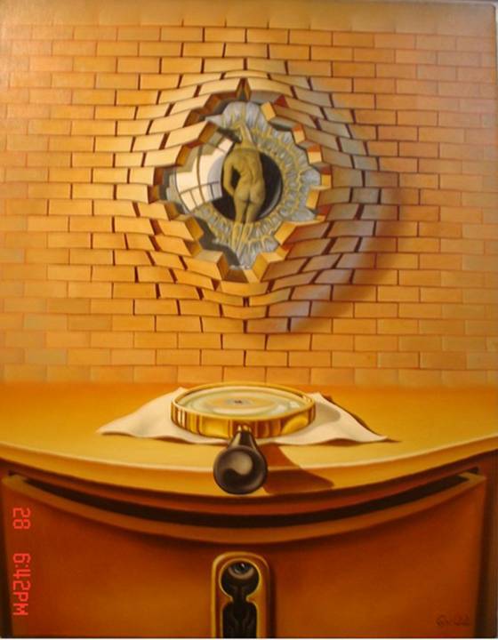
"Learning to see"
Lohmuller Gyuri
Oil on canvas - 17 inches x 22 inches
http://en.artscad.com/A.nsf/Opra/SRVV-6NTKVN
Lohmuller Gyuri
Oil on canvas - 17 inches x 22 inches
http://en.artscad.com/A.nsf/Opra/SRVV-6NTKVN
Human figure or even animal figure - eye in the middle, body figure
Principle:
Hierarchy - emphasize, dominance - the eyes breaking through the wall.
Balance - symmetrical - if split down middle, it seems to be similar for the both sides.
Unity/ Variety - the arrangement of the bricks, magnifying glass, cupboard create a feeling of completeness
Rhythm - arrangement of the bricks
Elements:
Color: light color at the top is to draw reader's attention, and dark color at the bottom is to make the contrast.
Line: thicker line to thinner line, blurred line to clearer line.
Shape: rectangular - bricks in 3D form, circle - eye iris, magnifying glass in 3D form.
Texture: glossy - portraying the reflection's on the eye.
So, I will choose this as the basic Typography concept for my coming design.
Conclusion:
These two Surrealism artworks inspired me to have a basic concept for my coming design, which I can use the unexpected design match to bring out the messages of my design title to be more outstanding.
Reference:
Lohmuller Gyuri Art Gallery : http://en.artscad.com/@/LohmullerGyuri
Creative Typography are : http://www.68ds.com/2009/10/25-sets-of-smashing-and-creative-typography-art/
Friday, 16 September 2011
I Wanted More, Until I Found "You".
It inspired me. I love diaries. I love memories.
It has been past few months but somehow still feels like yesterday.
Numbers of pictures. Overwhelmed with memorable moments.
This activity was carried by a girl, who did this for her final exhibition.
She set a mission for herself: Take a photo with foreigner and get a thing from he/she.
Every single photo, every single thing donated by foreigners,
whom came around the world, she had collected.
"They" came from difference places... and then were brought together here,
in the exhibition showroom,
by the efforts of the girl.
in the exhibition showroom,
by the efforts of the girl.
Her act was astonished me.
It inspired me to be a Backpacker!
Yea, I wanted to be a backpacker, explore and walk around the earth, along with a DSLR.
I love to capture the moments,
even thought I understand that life cannot be captured, no turning back.
DSLR is one of my wishlist items. I had been planning to get a NIKON D90.
Sometimes, life doesn't happen the way you planned it.
I failed to get it and i was so regret.
i have no choice but i have to chuck my passion aside.
it was a luxurious thought.
Life without capturing the moments, is a life without colors.
However, it's still in my pending wishlist. I will not give up.
Sometimes, i would lost myself easily,
being distracted by surroundings easily.
I do not understand myself well.
I Wanted More, until I Found "You". -- My Dream, My Aspiration.
Subscribe to:
Posts (Atom)